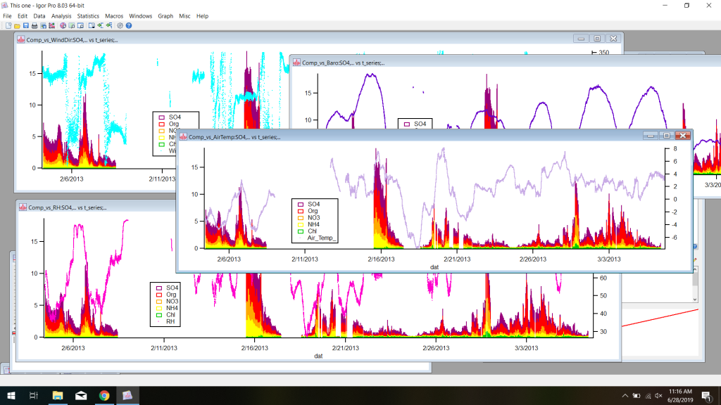
This week I was finally able to format my data so that it is now all on the same timescale with the same time intervals. That’s the main thing I’ve been working towards this entire time with all the coding and manipulation of data sets.
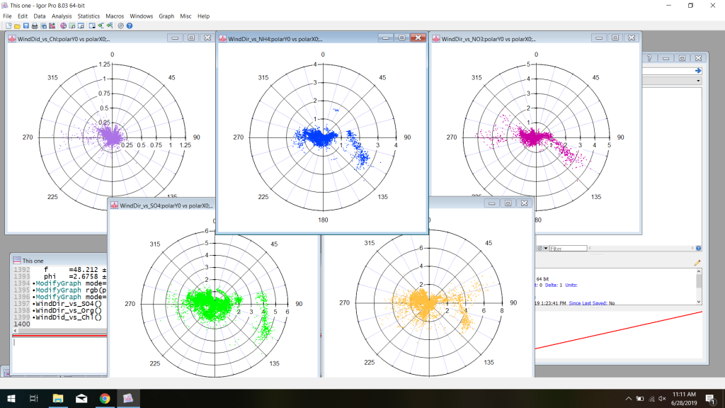
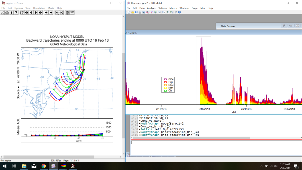
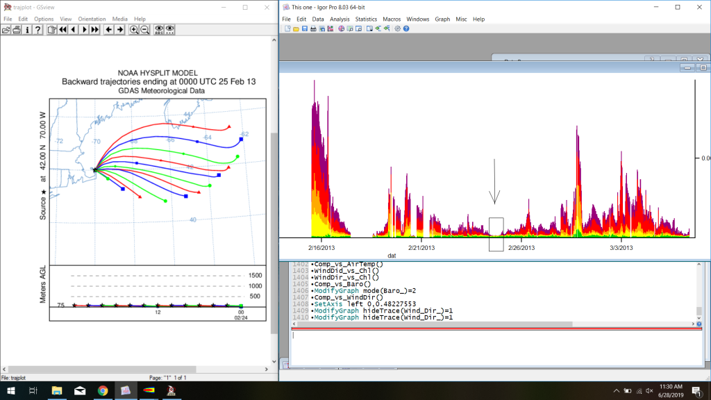
So what does that mean? It means I can now make ALL the graphs. So many graphs. It’s pretty cool comparing trajectories with the aerosol composition and seeing where everything is coming from; this is starting to make more sense to me now that I can actually see stuff happening. I’m going to look over a bunch of graphs I’ve made with my mentor, Ellie, and hopefully she’ll help me get a better understanding of what I’m looking at.
In other news, I went on my first Boulder hike with my roommate Alex, which was super fun. I’ll also be moving into my new apartment in Broomfield next Saturday which I’m really exciting about. No more drives back to the Springs in horrendous traffic! I get to see my cats every day!