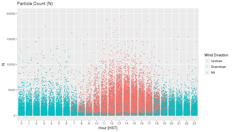
I had a blast making this recent graph which is my own pursuit (not requested by my mentor), and it does a great job of physically showing 3 variables (time, wind direction, and particle number).
The plot however required turning date, and wind direction into factors, and also cutting part of the wind data set to make it continuous and plot in two colors, rather than three.
Blue is down slope wind, orange in up slope, x axis is hour of day, and y axis is particle number. Difficult to see as a PNG, but still cool in my opinion.
-Alex