Modern day math is intense! In one’s mathematic career through school everything is done with pencil and paper in order to better understand the fundamentals of the equations you’re using. It’s easy to fill a page with numbers when solving a calculus problem and showing all your work. And though it’s good for one’s self to write every step down, computers are quite a bit more straight forward! Pages upon pages of math can all be done in a few lines of code in MatLab, but thats what its meant for, and that’s why it can cost a lot to get a license for it.
In this last week I’ve been teaching myself statistics, despite me being more of a calculus kind of person. Statistics, however, teaches one the ways of formulating correlations, something I haven’t had to do in the past. The data this produces is very interesting though! The attached images display forecast inaccuracies between the IFS and GFS forecasting models compared to the GPM observational model. When looking at the inaccuracies alone, the GFS data map looks chaotically more inaccurate than the IFS data map, yet their correlations appear to be very similar, but even those correlations settle down in different ways as their forecast hour (another variable) approaches present-time! (Like I’ve said previously, there’s a lot of variables at play). The big pile of numbers I originally started with is starting to take on a bunch of different forms that I had no clue would be so entertaining to calculate, and it serves as motivation when I find myself needing to learn new mathematic principles in order to unlock that information!
As a note, the graphs are arranged so the South-Eastern corner of Colorado is pointed towards you.
-Jason
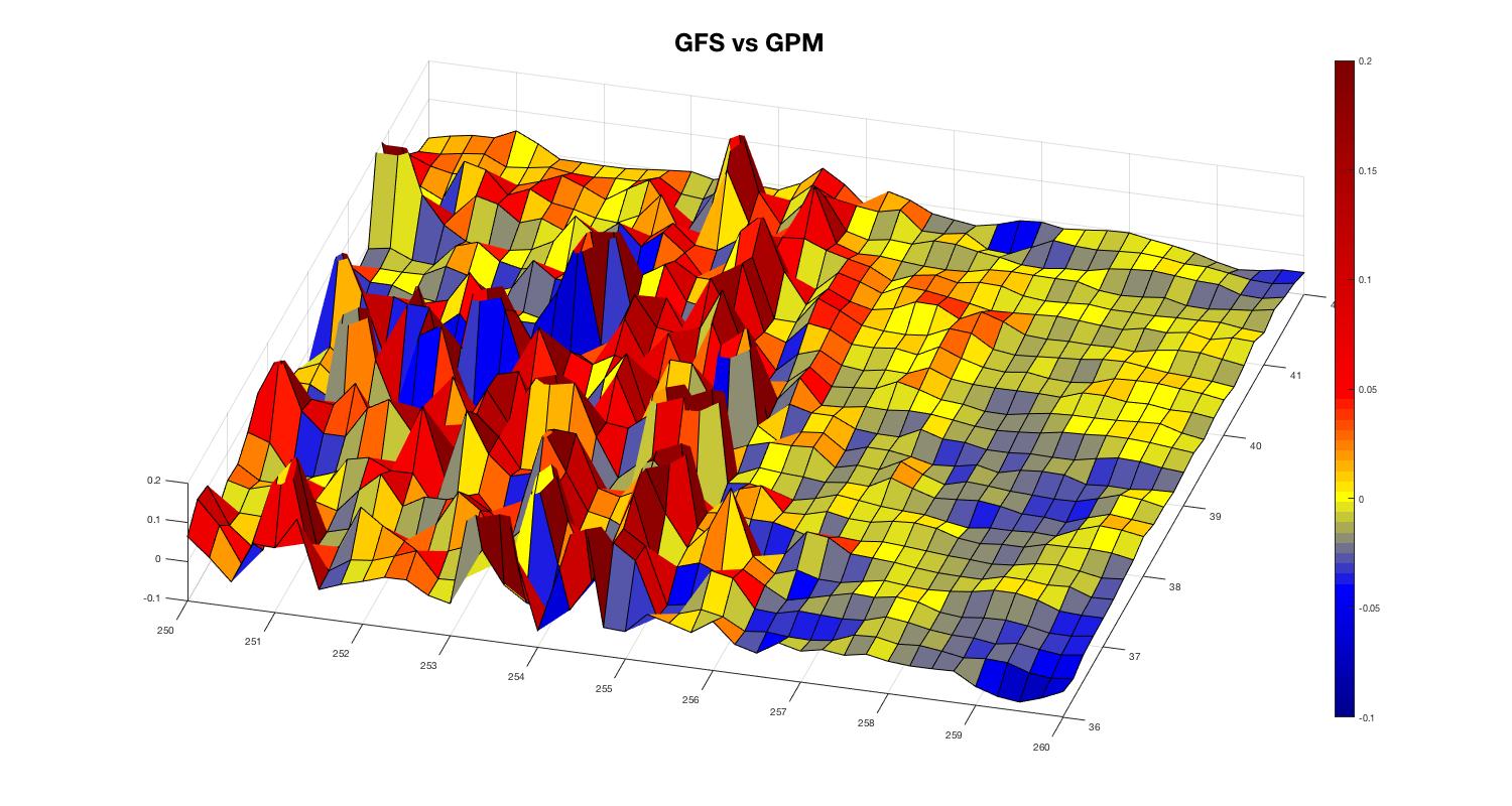
GFS Inaccuracies in Colorado
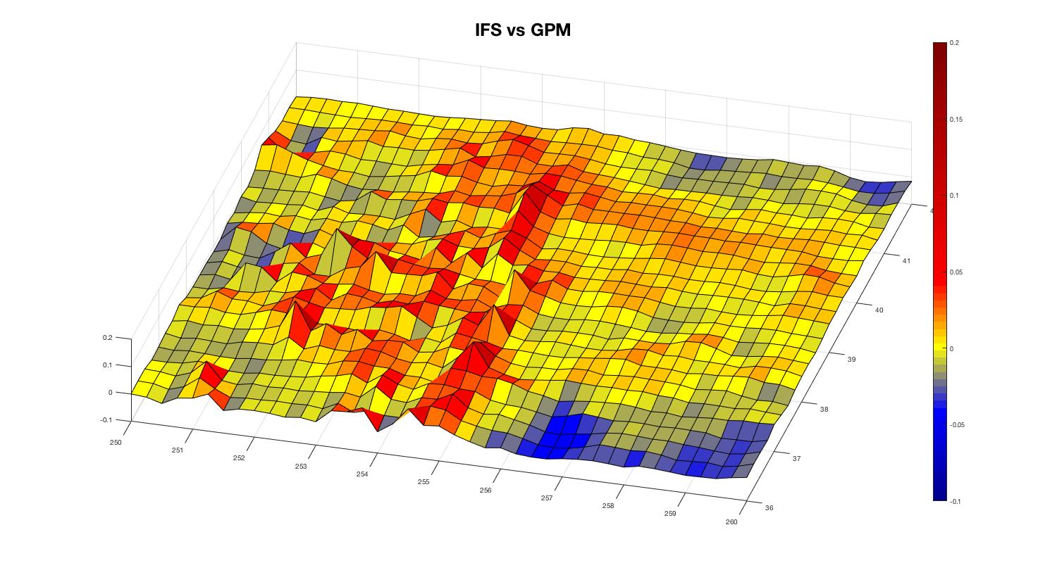
IFS Inaccuracies in Colorado
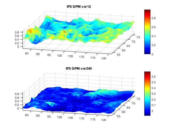
IFS Inaccuracy Correlations in Colorado
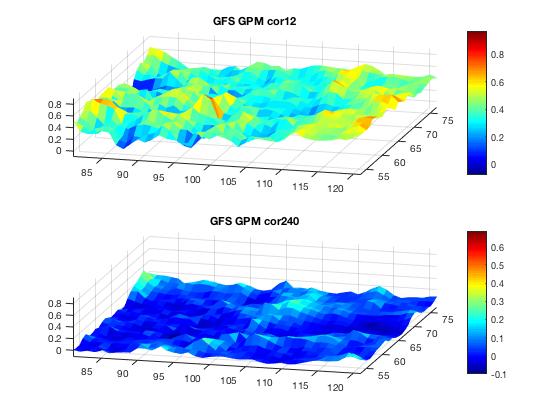
GFS Inaccuracy Correlations in Colorado
Those are outstanding Jason! Really awesome work on the project!