I’ve gotten a couple of requests over the past few days to compare the recent air pollution crisis in Beijing to UB air pollution. So let’s try to take a quantitative look.
First: Please note, this is not an exhaustive analysis but a cursory glance to give some perspective to the air pollution problem in UB.
Second, we’re going to talk a lot about a type of pollution called PM2.5. Read here (or here in Mongolian) if you are not familiar with these terms.
Alright, onto the comparison. Al Jazeera said, PM2.5 measurements were “600 micrograms per square [they must have meant cubic] metre at some monitoring stations in Beijing and was as high as 900 on Saturday.” This information does not specify critical information like what sort of time interval these measurements were performed over, but at least it gives us a ballpark number. Additionally, the @BeijingAir twitter feed (which, by the way, is the site that inspired @UB_Air!) reported that the highest PM2.5 24-hr average in the past few days was 630.6 micrograms per cubic meter (measured on January 13). Let’s use this number for our comparison. Though again, I have to put some heavy caveats and disclaimers on this: This is one measurement at one location within a giant city.
But how “crazy” is a PM2.5 24-hr average of 630.6 micrograms per cubic meter? @BeijingAir usually gives a very short health statement at the end of their tweets, like “unhealthy” or “hazardous.” But for this one? It reads “Beyond Index.” This value exceeds the WHO PM2.5 24-hr average guidelines by a factor of 25.
What about PM2.5 measurements in UB? Currently it is difficult to find this information in an up-to-date manner (check out a previous blog post to see one small way this is changing in the next few months). But we can compare the Beijing value to PM2.5 measurements in UB from previous years. Check out this chart from Annex A of the Dec 2011 World Bank report on UB air pollution (pdf here) that shows monthly UB PM2.5 values at different locations with in the city:
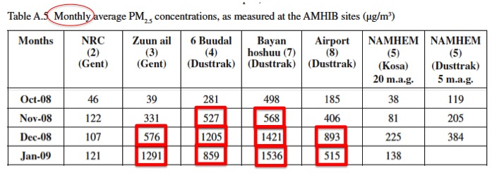
PM2.5 monthly average mass concentrations at locations within Ulaanbaatar. Source: World Bank Dec 2011 report, Annex A.
I’ve modified this table from the original to just focus on the winter months, when the pollution is at its peak (and also most comparable to this January 2013 Beijing air pollution crisis). I’ve also put red squares around monthly values that are comparable (or far exceed) that 630.6 micrograms per cubic meter 24-hr PM2.5 measurement from @BeijingAir.
Why do I keep bolding/italicizing/underlining “monthly?” Because I want to emphasize that we are comparing this Beijing air pollution – measured in days and ridiculously high daily PM2.5 values with monthly values at locations within UB. Those values in that chart are what, on average, you would encounter every day of the month – not just for a few short excursions into crazy high values for a few days. Every day of the month.
So who wins “worst pollution contest?” Beijing during its bout of horrible air quality the past few days or UB over its whole winter? I don’t know. As I said, this isn’t an exhaustive study to parse that out. I also think that it’s a very sad contest to have. But I do think this comparison underscores yet again the serious nature of the pollution problem in this city – especially in ger areas – every single day this winter.
2 comments on “UB air pollution and the recent Beijing air pollution crisis”
Comments are closed.