This morning the wind was unrelenting and several folks at breakfast were unconvinced that it would let up at all today. However, I was holding on to some hope that we’d get some flights in, mostly due to something I’d seen on the first weather forecast I picked last night, which showed the winds beginning to back off around 10 am. After heading out to the AMF to do some work and ensure all batteries were charged and systems were ready to go, I checked on the windspeed… 10 meters per second – too high to fly our DataHawk. After about an hour at the facility (at exactly 10 am!) I noticed that the orange markers outside of the door were no longer being blown around and went back to the weather display. I was thrilled to see that the wind had dropped to around 5 meters per second! At this point I raced back to the Air Force facility to alert Jack that it was time to fly!
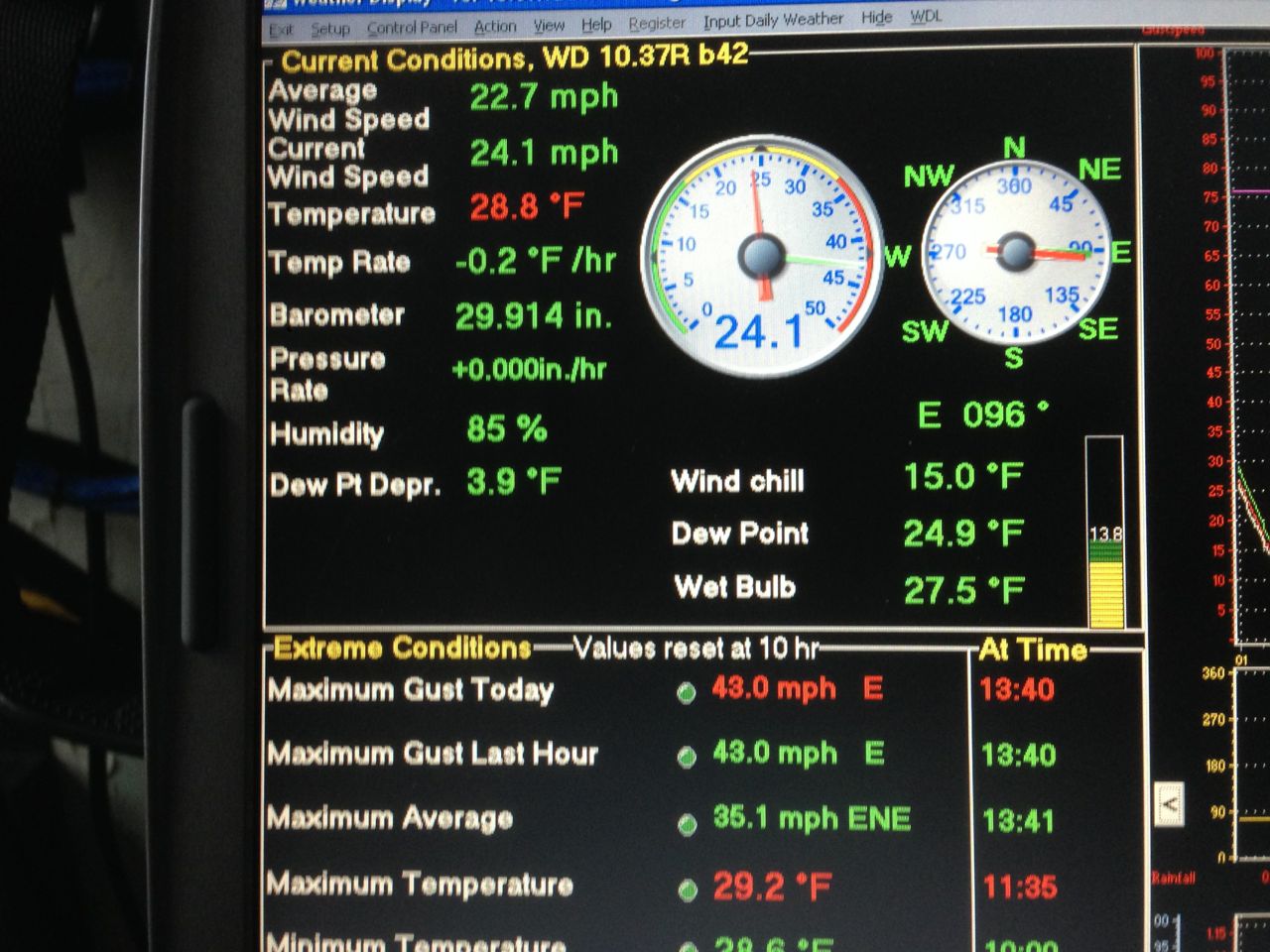
The weather display inside the Air Force station this morning. It wasn’t looking good!
In total, we got four solid flights in, mostly flown by the autopilot, and collected a substantial amount of data. It was the first time in quite a while that Jack was able to put his hands in his pockets while the plane was flying – the recent high winds and fog had forced him to keep them close to the controls at all times in order to take control of the aircraft if things went south (or given the wind direction, more likely west). He even managed to snap some photos of the aircraft in flight as it passed by his location! In addition to our flights, the Sandia and Penn State team got the tethered balloon system back in the air as well, sending the balloon all the way up to 300 meters! At around 3:00 pm, the winds kicked back up, and were accompanied by snow and fog so we halted our operations for the rest of the day.

With low winds, the autopilot did most of the flying this afternoon, which allowed Jack to take this photo. If you squint, near the center of the screen you can see the DataHawk buzzing by at 15 meters above ground level!
One neat feature in the data from today’s flights – for a while I’ve been trying to figure out the best way to map the surface that we’re flying over at any particular time. I’d always imagined that the sensors which give the autopilot information on whether the aircraft is level – the ones that had given us so much grief in foggy and cloudy conditions – might provide a solution to this problem, as they’re effectively measuring (qualitatively) the surface temperature. Well, for some of today’s flights, we performed very low level (~15-20 meters) extended legs from well over the land surface to an area of open water offshore. The signal from the downward looking thermopile (aircraft orientation) sensor is shown by the colored circles in the figure below. It very clearly illustrates some of the surface inhomogeneity, both over land and offshore. Notable features include the runway (lighter blue dots), which is darker and therefore a little warmer than the snow covered surface around it, the ice covered ponds to the southwest of the hangar and north of the runway. Additionally, this sensor clearly shows the transition from colder temperatures (blue colors) on land, slightly warmer temperatures in a region of thin, shore-fast ice along the coast (green colors) and even warmer temperatures when reaching the open water at the most northerly portion of our flight (red colors). Being able to separate these features is important because it allows us to sort the atmospheric measurements as a function of the surface type directly beneath them. Fun stuff!
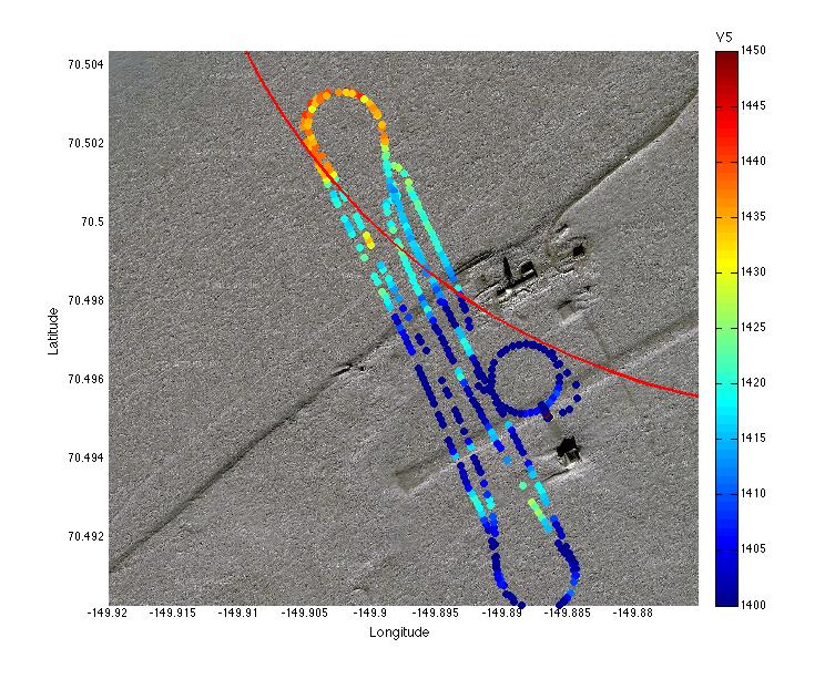
Relative surface temperature, as mapped by our downward-looking infrared aircraft attitude sensor. Note the open water (red colors offshore), sea ice region (light blue/green colors offshore) and the impact of the runway and pond regions (light blue colors — see satellite image below for reference) on surface temperature.
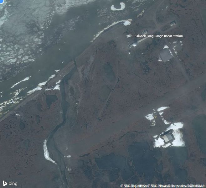
A (non-current) satellite image of the Oliktok Point facility. If you match this figure with the one directly above, you will be able to note some of the on-shore features that result in warmer surface temperatures.